
3D Facial Scan Interaction
Interaction Design, UI Design
About the company
Metamason is a health technology startup developing a mobile platform that allows clinicians and respiratory therapists to take 3D scan data of patients’ faces and create a truly personalized 3D printed Continuous Positive Airway Pressure (CPAP) masks.
Context and challenges
Metamason’s ambitions were to create custom on-demand CPAP masks to address the fundamental fit problems found in standard mass produced masks. Launched in 2016, Metamason developed an innovative scanning application that captures 3D face scan data and generates masks on-site. The application was functional but had a lack of thoughtful user experiences and critical interactions.
My goal was to design an intuitive scanning interface and user experience that would ensure that respiratory therapists and respiratory technicians of any skill level would be able to take an accurate scan of their patients’ faces efficiently and reliably.
My role
Working as the sole designer within a small team, I took full ownership of all design responsibilities, from concept to final designs, including conducting research and translating the results into thoughtful user experiences, and implementing critical interactions within the mobile/web-based application while balancing utility and seamless integration into the workflow of sleep lab clinicians and DME practitioners.
Approach
Test the current Metamason product as well as other scan applications to understand pain points from the user’s perspective.
Optimize design within technological constraints by understanding the requirements and restrictions of both the software and hardware.
Provide clear design guidelines, create iteration plans and feasible scopes for engineers.
Understanding the requirements
The hardware
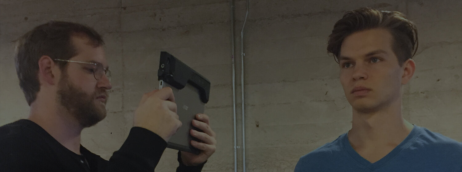
One aspect of Metamason’s business strategy was to provide participating DMEs and Sleep Labs with a specialized 3D scan capable tablet, pre-installed with the Metamason application. Using this tablet, respiratory therapists and DME technicians would perform 3D scans of the patient’s face.


Generating usable scan data was contingent on two key requirements:
The sensor had to be pointing at the subject within a certain minimum distance.
Tracking was only successful when the object to be scanned is in view and at a relatively consistent distance. Pointing the sensor away too far from the subject or varying the capture distance too much would lead to reconstruction errors.
Movement around the subject had to be done in a slow and steady motion.
Erratic or fast movement of the camera would lead to blurry, inaccurate data.
The software
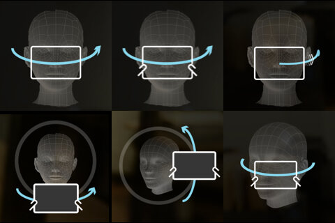
The Metamason application integrated ReconstructMe, a real-time 3D scanning system, as a major component of its functionality. To help me better understand the scan function, I conducted a test with my colleagues to study their gestures and movements while performing a 3D scan of a subject’s face.

Too far and the face was off-center

Too far and the face was off-center

Too close and the face was cropped

Within acceptable distance but the face was off-center
Task
Each colleague was tasked with scanning the face of a subject using the scanning app.
Result
By observing my colleagues performing a scan, I learned that this early iteration of the app had two major problems:
Without any on-screen guidance, my colleagues had a difficult time keeping the subject’s face centered and the scan distance consistent, even in spite of their familiarity with the scanning process.
Without real-time scan results, my colleagues tended to capture data haphazardly and were then forced to visit and revisit previously scanned areas in order to to search for gaps in the scan data.
Comparative Usability Testing
In addition to the usability test I performed on Metamason’s app, I tested two other apps with similar scanning functionalities on my colleagues in the hopes of gaining deeper insight into how people typically interact with capturing objects on these devices.
Fyuse - 3D Photos

Task
Each colleague was told to follow the instructions the app provided and to take a 3D photo of a selected object.
Result
The first of the apps I tested, Fyuse, relied heavily on its graphical interface to ensure that users had achieved full coverage of their subjects by displaying a visual guideline that users would have to follow along with a crosshair. I found, however, that people became overly fixated with keeping the camera trained on the guideline.
“I was trying too hard to trace the line... I wasn’t even looking at the mug (the subject). The process took too long, and my hands got tired.”
“I am trying to follow this line... It’s hard!”
Google Photo Sphere

Task
My colleagues were instructed to follow the onscreen prompts and to take an image of anything around them.
Result
By contrast, Google Photo Sphere had a very minimalist UI: a small viewfinder with a centered circle, surrounded by a frame with four dots indicating the different directions the user was supposed to move their camera. It was unclear to people that they needed move the camera to find the next dot and repeat the same interaction until full coverage was achieved.
“(Pausing after the first shot)... Where am I supposed to go? (Randomly moving the camera around.)”
“I think I’m done... (Unsure) I don’t see any more dots. (The resultant, stitched image ended up having many gaps in coverage.)”

How might we intuitively guide users throughout the scanning process without distraction or interruption, while ensuring efficiency and reliability?
Based on the test results of the current iteration of the Metamason app and the user feedback from interacting with Fyuse and Google Photo Sphere, it became apparent that visual guidance could be a distraction, but that without it, it was easy to get lost in the process. The ideal solution to the problem lay somewhere in between the two extremes.
Design solutions
Working closely with the developers and taking the technological limitations into consideration, we honed in on a solution by repeating a three-step process of design, review, and then test. The following are the solutions we achieved.
Solution 1:
A frame to stay focused
Keeping the camera pointed at the subject while maintaining a certain distance between the camera and the subject at all times was critical, but difficult to do while simultaneously moving the camera. My solution was to use a dark frame with an oval-shaped cut-out to help users stay focused on filling the frame with the subject’s entire face. This helped ensure the camera was pointing at the right direction within a certain distance.
This frame would appear from the first step of the scanning process, when facial recognition is being performed, and would continue to be shown throughout out the entire scan procedure.

An early prototype of the frame, which was a simple overlay on a regular video camera app.

Facial recognition
The frame appears to guide the user on how to position the camera and the correct distance from which to perform the scan.
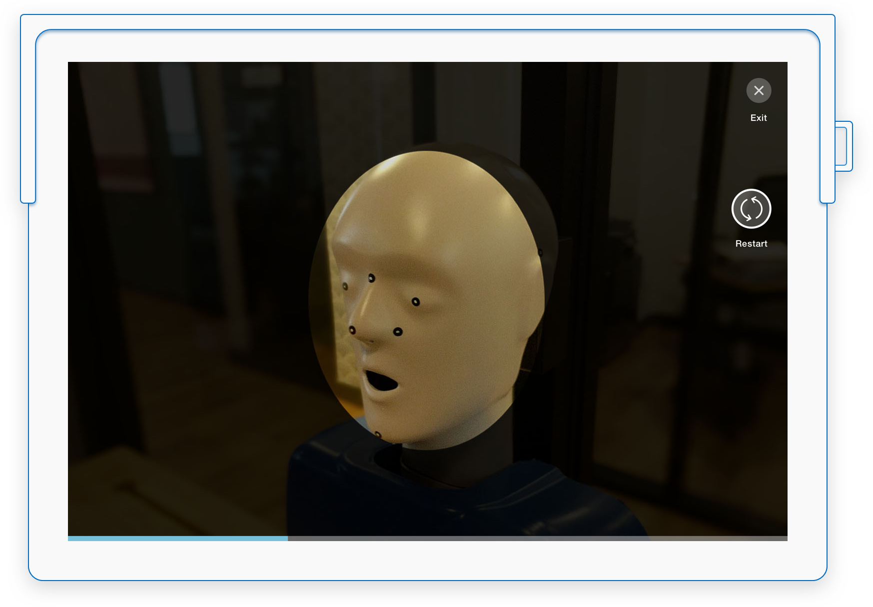
Distance guide
The frame stays throughout the process, helping the user keep the camera within an acceptable distance.
Solution 2:
A path to follow
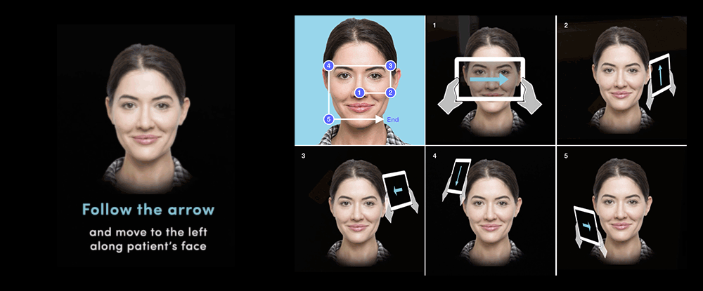
In order to have a smooth, responsive app, the team decided to turn off the real-time 3D mesh generation feature, which meant users were not able to see scan results in real-time. In order to ensure full coverage, especially of the critical nasal area of the subject’s face, I was inspired by design of Ikea’s floorplans; in particular the one-way route that steers shoppers though all departments of the entire store.
With that principle in mind, I designed a scanning path to ensure every angle of the nose and the surrounding area was captured in one continuous motion.

Solution 3:
3D graphical guidance
The next step was to think about how to guide the user throughout the scan path. I designed a simple instructive on-screen element in order to clearly communicate the motions the clinician was supposed to perform in order to ensure full coverage. Along with the on-screen text instructions, a 3D representation of the camera moved around in 3D space to demonstrate exactly how to move the camera around subject.
After several testing multiple locations and sizes for the instructive element, I decided to have the graphical guidance just to the left of the frame, where it was simultaneously not pulling the user’s focus away from the subject while also being in a place where the user can quickly look to should they need guidance.
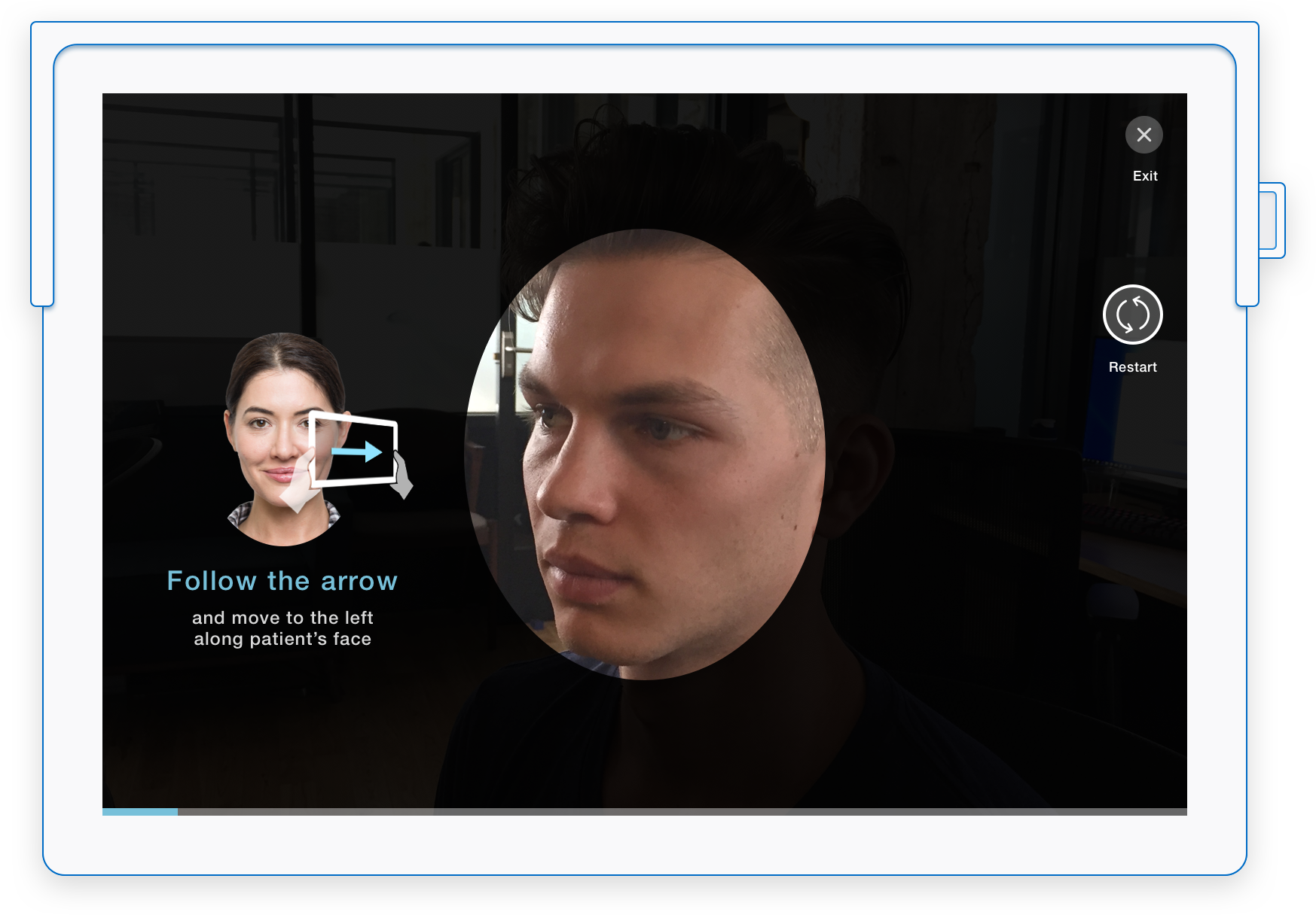
Graphical guidance explorations
Solution 4:
Real-time feedback when needed
As camera position and speed was being tracked relative to the patient’s face in real-time, I designed the frame to highlight in blue and provide a short message to call attention to the user when they were moving in wrong direction, moving too fast, when the the subject’s face was off center, or when the camera’s distance was outside of acceptable bounds.
The blue highlight was just enough to get the user's attention without feeling like an admonishment, which could increase stress and anxiety and make it more difficult to maintain a steady pace. Rather than telling the user what they were doing wrong, the messages strove to suggest how to adjust their behaviors in order to generate better scan data.

Directing users to adjust the distance between the camera and the face.

Directing users to pause while facial detection is being performed.

Reminding users when they should begin following the designated path.

Reminding users to slow down when rapid movement is detected.

Reminding users when the face is off-center.
Solution 5:
Scan examination tutorial
After scan completion, a built-in scan visualization allowed users to verify the accuracy of the scan before uploading it for print. I designed a tutorial that included an introduction to the multi-touch gestures used to control and view the scan results and demonstrations of how to examine them based on visual examples.


Scan flowchart
In addition to the regular scan procedure, I collaborated with the QA and the back-end Developers to create a list of potential technical errors in order to include them into my detailed scan interaction flow.
Since Metamason was in such early stage and did not have a customer service team in place, I wanted to provide simple instructions to users so they could understand what they can or can’t do, or even how to fix things if problems arose, such as in the case of a camera connection error or other hardware related issues.

Animated scan demo
Result
Metamason gave me the opportunity to be part of the entire product development process, collaborating and working closely with engineers, QA and our industrial designer from beginning to end. While FDA complications meant the Metamason application was shelved, it was an extremely valuable experience in which I gained the knowledge, self-sufficiency, and confidence to conceptualize and execute designs to solve the problems we encountered.
The modest size of the Metamason team allowed us to operate in a truly agile environment. As challenges arose in the design process, I was able to brainstorm and collaborate with every member of the team, taking their feedback and ideas and integrating them into my work as we progressively worked towards an ideal solution for a process that existed only on the bleeding edge of medical technology.