

EMR Data
Visualization Tool
UI Design
About the company
Patient Insight is an early-stage health-tech startup that focuses on developing solutions and analytics that improve the effectiveness of physicians at the point-of-care.
Context and challenge
In spite of a universal trend towards user centered design, many facets of the healthcare industry still struggle to keep up with this progression towards usability, leaving physicians and patients interacting with tools that sacrifice intuitiveness and ease-of-use for raw functionality. EHRs (Electronic Health Records) are an essential part of a physician’s day-to-day, but between a lack of interoperability between systems and usability that does not match actual clinical workflows, they can prove to be an unexpected source of struggle.
Patient Insight’s goal was to create a visualization tool that leverages the existing EHR system as a data warehouse, reorganizing and displaying complex health data in a compact and intuitive way.
My role
As a UI Designer, I was brought in to the team to help on design the interface for a new EHR concept, focusing heavily on the details of the UI presentation and visual consistency.
Timeline
We had a span of roughly two weeks before we would deliver a presentation to Kaiser Permanente in order to secure further funding and support.
The problems today
While modern EHRs provide all the functionality a physician needs during a patient’s visit, it can take numerous intermediate steps to complete tasks that sometimes do not directly relate to the care of patients or tasks that would be performed more efficiently if done by the physician’s assistants.
In practice, this monolithic structure introduces a lot of down time in a physician’s process, resulting in a reduction of the number of patients they are able to see in a day, or in certain situations, timely access to time-critical information.
“Speed is everything, changing direction is easier than stopping.”
“The technology should be invisible, helping us (the physicians) instead of hindering us.”
“The future EMR should help a care team whose goal is health, not heathcare, and who, along with the individual, has access to all the data. ”
Patient Insight’s goal was not to create an entirely new EHR system — rather, we sought to take the existing system and synthesize a tool that streamlines out the complicated features and functions of the existing system and to reorganize the displays of relevant health information in order to increase productivity and facilitate compliance with health care providers.


We started off with interviewing five healthcare professionals to understand their real, day-to-day workflows and patient encounters. Based on the feedback and multiple rounds of brainstorming, iterating, and reviewing with a health management consultant and emergency physician, we regrouped a physician’s tasks and broke them up into four major functionalities:
Patient Summary
Timeline
Notes Navigator
Record Locator

Design principles
I developed two principles that embodied what I sought to achieve with my design:
A clean and minimalist design for effective text-heavy information display.
A limited use of color to allow even attention to all information and avoid distraction.
Patient Summary
The decisions physicians make are based on examinations, an overview of a patient’s symptoms, as well as a patient’s medical history. Beyond simple inefficiency, it could be dangerous to a patient’s health if the information on their EHR is not properly displayed. To increase clinical efficiency, I grouped the health data into related clusters, highlighting only relevant information in order to:
Keep track of a patient’s care plan with filters by specialty.
Alert doctors of items that are past due and in need of action.
Provide a quick overview for the biomarkers and tracking over time.
Allow direct access to family history and Care Team summary.
Furthermore, instead of traditional tabs, I presented them in tiles to help physicians digest a variety of information effectively and make comprehensive decisions based on a broader overview of a patient’s records.

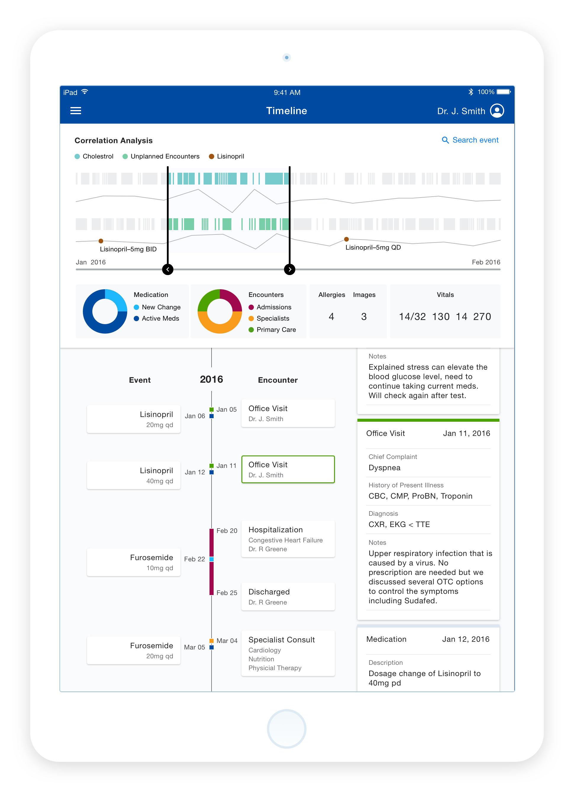
Timeline
Beyond a patient’s heath data, their health history also plays an important part in helping physicians make their diagnostic decisions.
I designed a scrollable time table that visualizes a patient’s treatment, hospitalization, symptoms, and other relevant information, which is displayed in chronological format in order to better visualize a patient’s health over time in a natural, intuitive way.
Notes Navigator
Time consuming documentation lookup interferes with face-to-face patient care. The Notes Navigator was designed to allow physicians to find notes from other doctors of a patient in a timely manner.
Utilizing the Natural Language Processing Engine, we aimed to optimize keyword search by providing the most common terms across numerous categories. For quick and easy identification, I color labeled selected categories and used bubble sizes to directly correlate to the commonality of each keyword.

Record Locator
The Record Locator was designed to allow physicians to browser a patient’s critical data within a single location. For consistency, I used the same design treatment as the Patient Summary, displaying data and records separated into tiles for better clarity and for a broader overview of the information.

Result and reflection
It was an intense but exciting two week experience. Designing for a specific profession was by far the most challenging aspect of the project, familiarizing myself with the established language that physicians use in their industry, in addition to internalizing a great deal of information about the medical field. Speaking with the emergency physician and listening to the health management consultant’s experiences with physicians helped me better understand the workflow issues that are at the root of many EHR usability problems.
However…
Given the brevity of the project’s term, I believe we were only able to scratch the surface of the subject. Under the larger healthcare umbrella, there are distinct sub-classifications that have their own workflow and unique healthcare needs. For example, the workflow of a primary care provider who sees a larger volume of patients every day would be very different to that of a specialist who treats fewer patients daily, but may require extra attention for each patient.
There are still many things to learn about physicians and their work before we can begin designing a more competent tool for their daily use. It was unfortunate that the Patient Insight project was not fully realized. Still, the process of designing for it helped me realize the potential for impact the application of modern design principles and technology could have in improving the timeworn tools that are still in use by the healthcare industry today.