
IRIS—Concept Automotive HMI
UI Design, Interaction Design
About the company
Fujitsu Ten Corp. of America is a leading provider of high-quality automotive audio, video, navigation and control systems. In 2011, The UX Group was formed to begin innovative product development specifically targeting the North American marketplace.
Context and challenges
According to the National Highway Traffic Safety Administration (NHTSA), driver distraction accounts for up to 50% of all accidents in the United States, and a major contributor to driver distraction is cell phone and infotainment system usage while on the road. In order to better understand this phenomenon and to get a sense for the challenges drivers were faced with on a daily basis, I had a Scion branded multimedia system installed on my automobile. Following a one month review of the Scion multimedia system, I presented my experiences and thoughts back to the Fujitsu Ten UX Group, and was tasked to collaborate with an Industrial Designer to improve the Scion multimedia system.
My role
Paired with an Industrial Designer, I took the full ownership of this project and was responsible for research, conception, interaction and visual design, as well as the final presentation as the lead designer for this project.
Approach
Given two months, my strategy was to find the root causes of the fundamental distraction problems that exist in current day automotive infotainment systems and design a new concept system that’s simultaneously intuitive and easy to learn, while eliminating the typical driver distractions associated with using multiple devices on the road.
Evaluation
While collating my thoughts on my month long review of the Scion infotainment system, I organized my key points into groups of similar context. As I did this, a major pattern began to reveal itself:
Most of my issues I had utilizing the existing system were the result of a poor organization scheme.
Problem 1:
Incomprehensible grouping

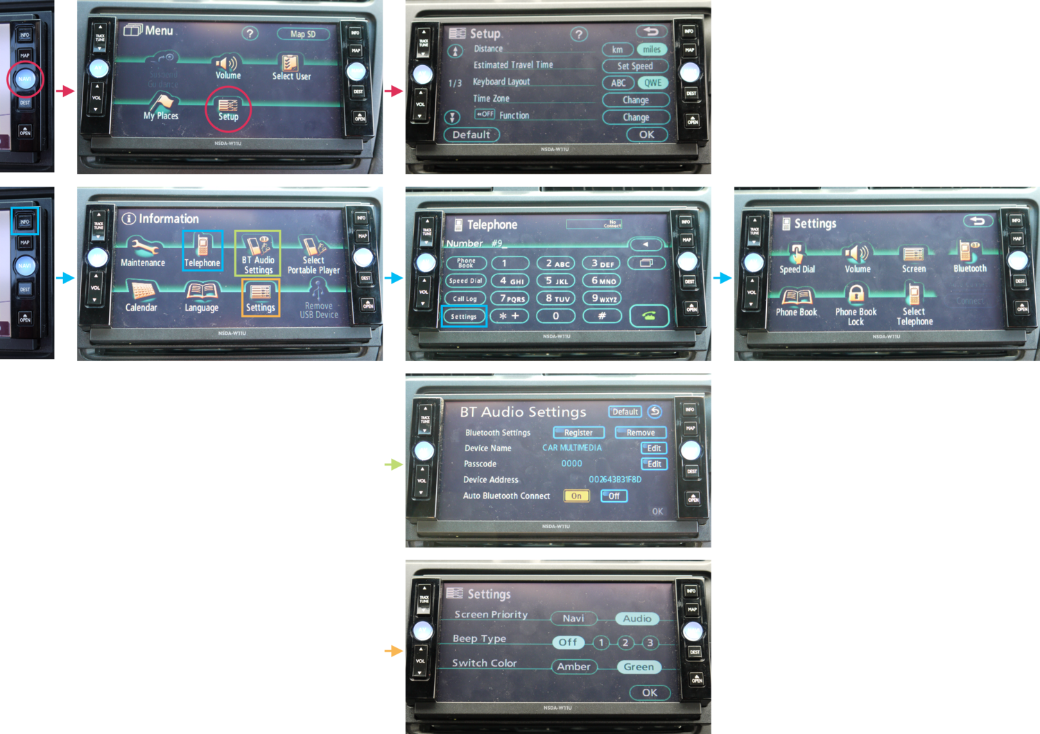
The Scion system featured two columns of physical buttons located to both the left and right side of the screen. Three AV (Audio Video) related buttons are grouped on the left column, while four other buttons, INFO, MAP, NAVI (Navigation), and DEST (Destination) are grouped together on the right. The circular shape and distinct coloring of the AV button on the left and NAVI button on the right immediately imply a grouping based on functionality, however, of the right-affixed buttons, the topmost button, the topmost INFO button is completely unrelated to navigation based tasks.

The AV button opens the on-screen AV Menu, where the user can toggle playback with the “Audio” button, adjust the equalizer/balance through the “Sound” button, and change the active audio source (“AM”, “FM”, “SAT”, “Disc”, etc.)
A confusingly named “Display” button that turned the screen on/off was also present on this screen, which seemed out of place given the screen real estate dedicated to audio functions.

The NAVI button only brings up the settings for the navigation. It does not bring up a map nor a prompt asking the user to input or search for a destination.
It is misleading when the similarly colored and shaped AV button brings up a screen of AV related activities.

The INFO button, which is grouped with the NAVI buttons and highlighted due to its positioning as the first button in its cluster, opens up a menu with various miscellaneous, mostly unrelated functions, such as checking the vehicle maintenance report and making phone calls.
It also contains the majority of the settings screens for features that exist throughout the system.
Problem 2:
Unconsolidated structure
Further complicating the matter, in spite of grouping most of the settings options in the Information menu, many of the system’s individual subsystems also had sub-settings screens hidden within them. For instance, the Navigation menu has its own “Setup” option that allows configuration of navigation based functions.
The Information menu was perhaps the most confusingly structured menu. While the top-level menu has a “Settings” button, pressing “Telephone” opens up a dial pad which has its own “Settings” button. Additionally, “BT Settings” on the top level menu would open up a menu of important options related to Bluetooth connection settings, while pressing the top level “Settings” option only opens a menu with options that affect the audio and visual feel of the system.
This labyrinthine flow for doing something as simple as finding and adjusting a setting meant that a driver would have to navigate through multiple menus, and in many cases ending up at a dead end and having to back out to the top level screen to try a different path.
Problem 3:
Multiple steps for simple tasks

Radio presets such a widely used feature that many vehicles offer dedicated physical buttons on the center console for them. The Scion system hides these options three levels deep in the system. The driver has first open the AV Menu first using the physical button, then select “Audio” to open the Radio screen in order to find the radio preset buttons.

Audio volume adjustment buttons are on the left panel and are accessible to the driver at any time via physical buttons to the left of the screen. However, due to the unconsolidated structure of the system, phone volume and navigation guidance volume adjustment settings are found nestled in separate locations and require navigating through many screens to find.

Brainstorm
How might we allow different concurrent activities to be available to the user at any time while eliminating the need for separate screens for every function?
Design solutions
Solution 1
New system structure & controls for intuitive use

I decided to reconstruct and consolidate the features people expect of an infotainment system. I grouped system functionalities into four major categories:
Media, Contact, Navi, and Settings.
The Industrial Designer collaborated with me and designed a new frame based on the new four categories. Each category has a physical button located on the driver's side for quicker and safer access when jumping across different functions while driving.
We also removed the clickable buttons for audio volume adjustment, replacing it with a single nob that adjusts volume for any features that is operating primarily. There is also a physical power button right on top of the four category buttons to allow quick access to turn the system on/off.
Solution 2
Smart dual-display & Quick Access Bar for maintaining focus on the road


For the touch screen, I designed a new visual structure.
Main screen + mini screen
The Main Screen displays information for the primary activity the user is performing, while the Mini Screen displays background information for secondary functionality. Users can manually choose which function to display on the Main Screen by pressing physical category buttons on the left side of the device. Furthermore, the system will situationally and intuitively display primary information on the Main Screen and secondary information on the Mini Screen.
Quick Access Bar
The Quick Access Bar contains a set of on-screen buttons such as Bluetooth Settings, Volume, and SMS, allowing immediate access to these settings from any context. These buttons activate a drop-down on the Main Screen for speedy task management. For example, the Media, Phone, and Navigation volume can be accessed from a single location with one tap.
In addition to user initiated drop-downs, the system would also generate drop-downs that appear on the Mini Screen for important, non-user initiated events. Incoming calls, Bluetooth connection status updates/requests, and other relevant auto-triggered information would be displayed in this region.
Sample use case
A driver is listening to the radio and using navigation at the same time.
The system recognizes navigation as the primary function and displays it on the Main Screen while displaying radio information on the Mini Screen. When the driver gets on the freeway, they feel they don’t need direction for a while, so they simply press the physical Media button to bring the radio information onto the Main Screen and navigation is relegated to the Mini Screen.
Suddenly the radio audio is is interrupted by a phone ring, the driver notices the system-activated-drop-down and sees someone is calling them. They press the button on the drop-down and accepts the call, the system turns off the radio audio and swaps the navigation to the Main Screen for better legibility while talking on the phone and driving, while call information is now occupying the Mini Screen.
Design


Impact
While the IRIS project was simply a design sprint and was not validated by any testing, the Scion system evaluation and the Lexus system production I did prior to this project played a valuable part in understanding the flaws in current-day automotive multimedia systems and more importantly, helped me hone my skills in analyzing how people interact with interfaces and conceptualizing the flow and structure of these complex systems.
The unveiling of the IRIS Concept Automotive HMI was a success and generated significant buzz in the automotive industry when it was presented at the Toyota Tech Expo in 2012. Following the positive feedback, I was teamed up with an Interaction Designer and assigned to design a second-generation evolution of IRIS, which was to be called AXIS.